Circle Nine

Discover fresh insights and innovative ideas by exploring our blog,  where we share creative perspectives

download (7)
Client:
Circle Nine Properties
Category:
Design
Start Date:
Jan 01, 2025
End Date:
Jan 10, 2025
Tag:
Logo Design, Branding
Budgets:
$1000.00 USD

Circle Nine Properties approached us to create a modern, bold logo that would encapsulate their vision as a premium real estate brand. Their goal was to develop a clean and impactful visual identity that not only communicates trust and innovation but also reflects a strong architectural character.

The brand wanted to stand apart from conventional real estate aesthetics by embracing a minimalist yet meaningful design — one that could resonate with both investors and end buyers, and remain timeless across various branding platforms.

Our Approach

We crafted a typographic logo blending elegance with sharpness. The typography was refined to reflect modernity and sophistication. The color palette (gold and black) was selected to represent premium quality and trustworthiness. A textured background was suggested to bring depth and real estate ruggedness into the brand’s look and feel.

The Challenge

One of the main challenges was the abstract nature of the brand name — blending the concept of a “circle” with the number “nine” in a way that feels intentional and iconic. The client wanted a minimal design, but it also needed to be memorable and unique. We had to ensure that the identity didn’t fall into the stereotypical visual language of real estate, while still remaining professional. Another key challenge was designing a visual identity that would remain versatile and consistent across a wide range of applications — from digital media and print to on-site branding.

What We’ve Done

Circle Nine Properties approached us to create a modern, bold logo that reflects their identity as a premium real estate brand. They were looking for a clean and impactful design that conveys trust, innovation, and a sense of architectural precision.

The Result

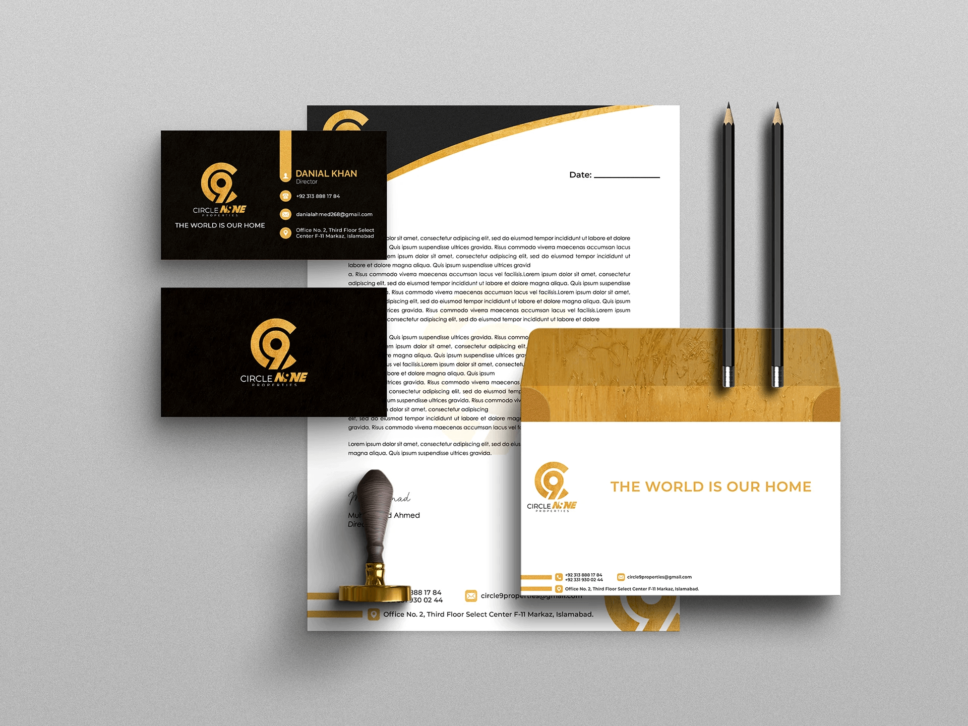
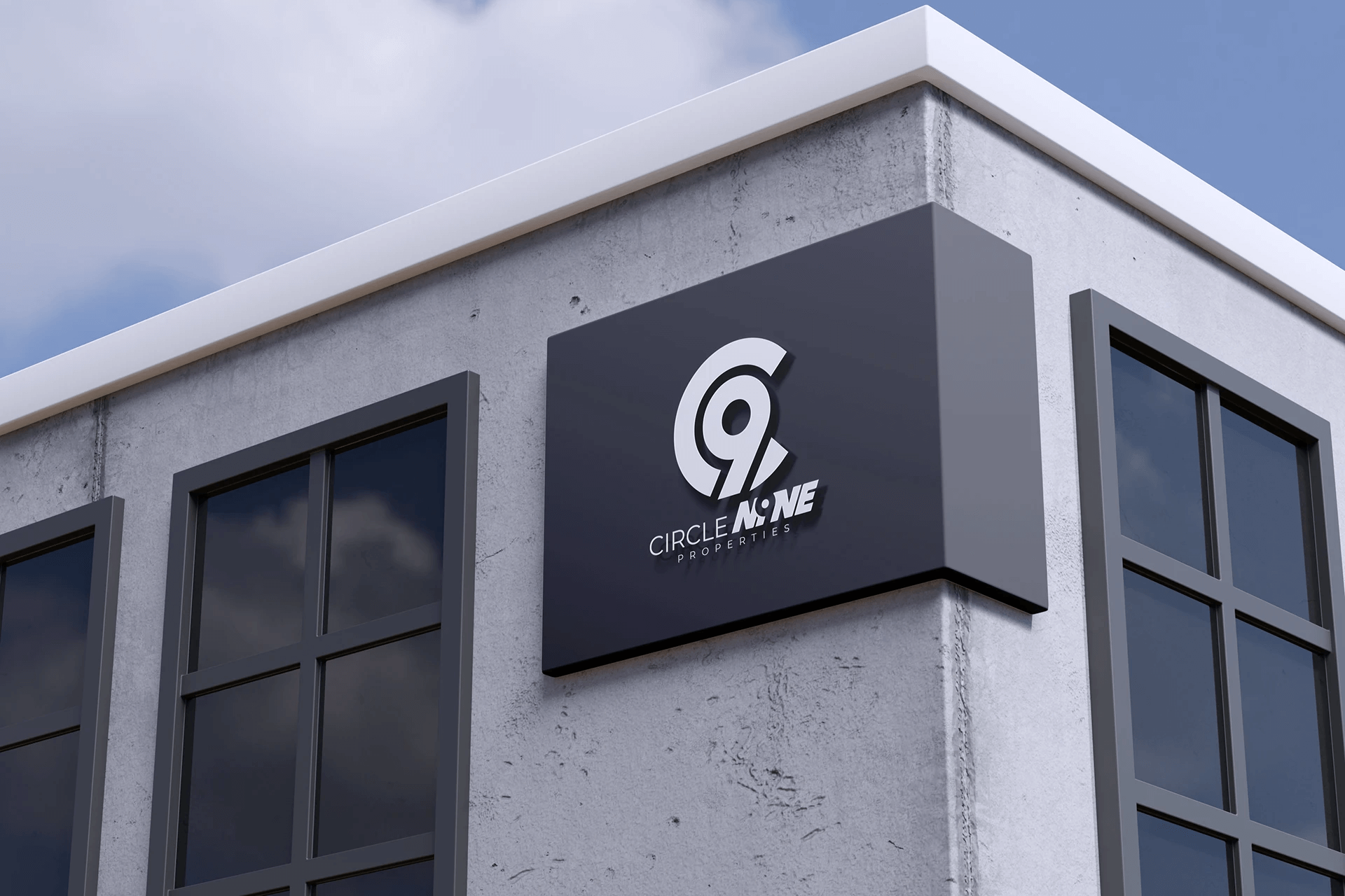
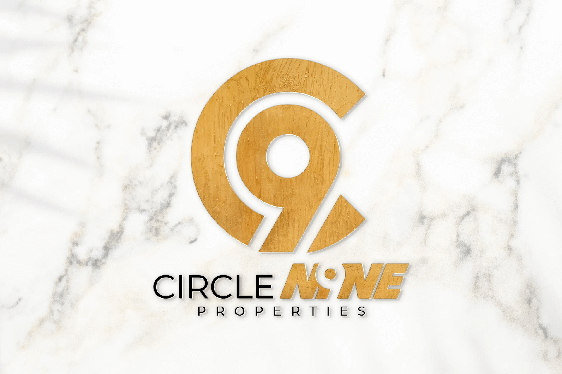
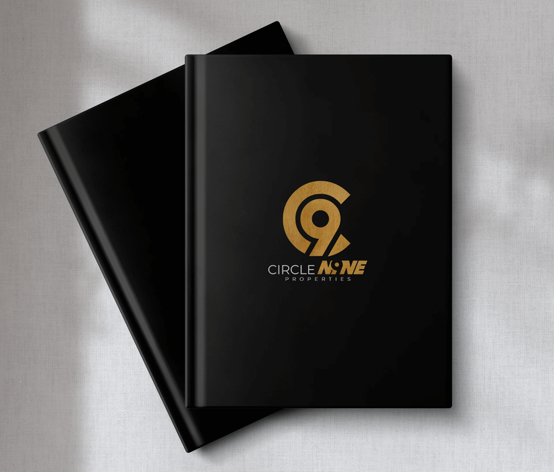
The final logo transformed the brand identity of Circle Nine Properties into something bold, refined, and memorable. With a clean typographic approach and a carefully selected gold and black palette, the brand now carries a luxurious yet grounded aesthetic that reflects its real estate values.

TangoMedia ensured that the logo worked seamlessly across all platforms, from digital applications and business collateral to large-scale on-site branding. The consistent design language has enhanced brand recognition, strengthened customer trust, and positioned Circle Nine Properties as a premium real estate brand. This project reflects TangoMedia’s commitment to delivering impactful design solutions that align creative vision with business goals.

Gallery

Create your account